
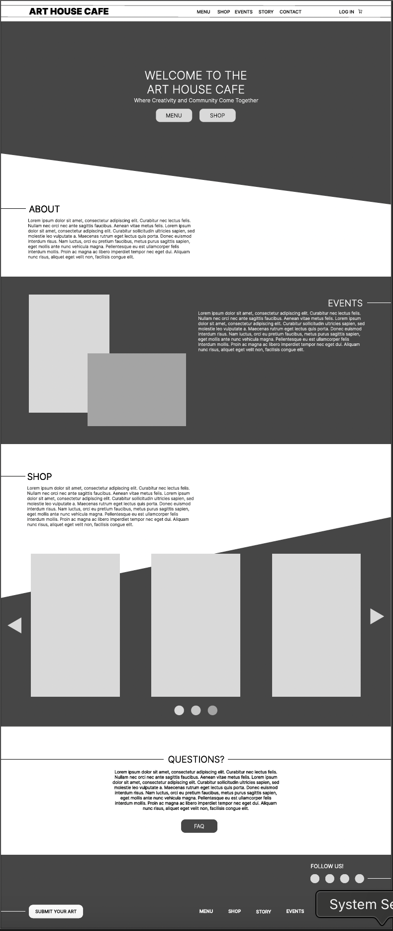
The low-fidelity wireframe for the Art House Café website was designed with the goal of creating a visually engaging and intuitive user experience that reflects the creative, welcoming atmosphere of the café. A key design choice was the use of slanted sections and generous white space, which together guide users naturally through the site’s content.
Slanted sections break away from the traditional grid layout and inject a sense of artistic flair that aligns with the café’s identity as a creative and community-driven space. These angled divisions also serve a functional purpose: they subtly direct the viewer’s eye downward through the page, creating a visual rhythm that encourages exploration without overwhelming the user.
White space was deliberately incorporated to balance the boldness of the slanted elements. It gives each section room to breathe, ensuring that key content— upcoming events, or gallery features—stands out clearly. This approach enhances readability, supports accessibility, and contributes to an uncluttered, modern aesthetic.
Overall, the wireframe combines visual storytelling with usability, aiming to capture the essence of the Art House Café while providing a smooth and engaging journey for the user.